Guess who's back
Back again. Tell your friends.

Hello! It’s been a minute.
In May, someone asked me what had happened to Fair Warning, and that they missed it in their inbox (thank you :)) but even that couldn’t drag me back into it, past my irritation at this very platform. The thought of needing to migrate subscribers to something else, for the fourth time, does not fill me with joy. But then, I realised, everyone is on Substack and nobody else seems to worry about it.
Then this week I met up with an editor friend I haven’t seen since about 2016, and somehow, we talked about newsletters. And although he did not take me up on my very generous offer of editing Fair Warning for no money whatsoever, it did make me realise that I got a lot out of writing it and I missed it. So here it is. (Errors mine; sorry in advance!)
On the home front
For older readers, just an FYI that I’m expanding “on the home front” to include Europe where it makes sense, particularly if it includes the UK.
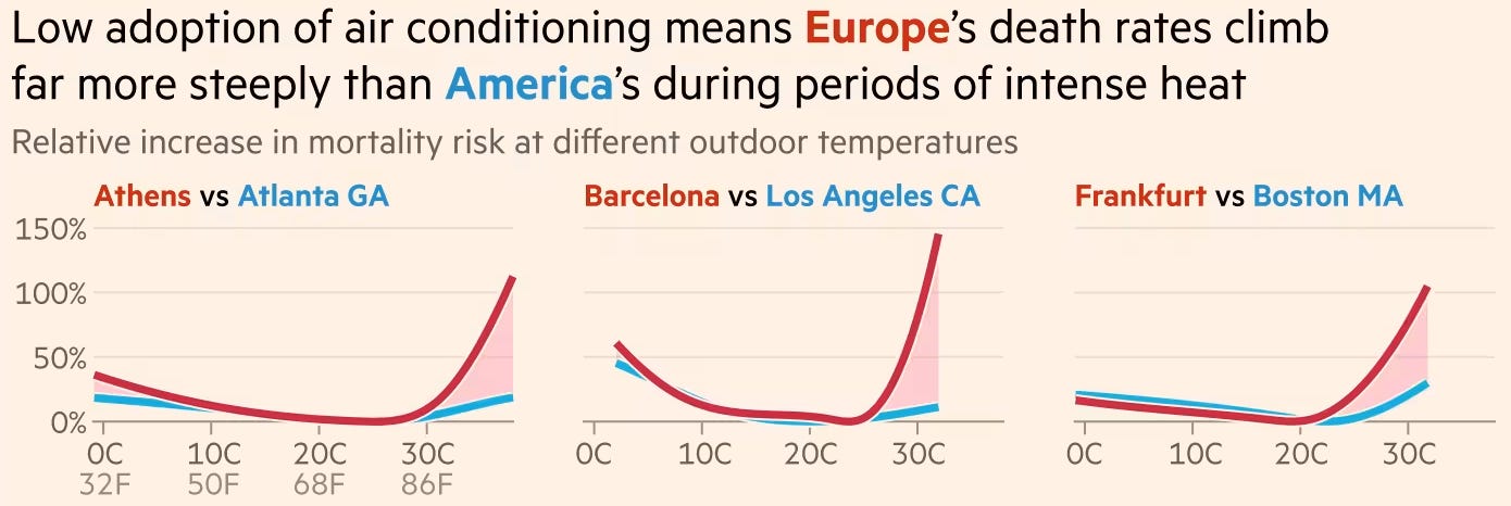
Britain and Europe need to get serious about air conditioning
Another great piece from John Burn-Murdoch at the FT. I didn’t want to screenshot all of the graphic because you should really click on the link and see for yourself, but it’s striking how different the mortality risk is. When I was living in NYC, the summers were consistently hotter, but most places had AC. I’d go and sit in a coffee shop in the cool and that’s just what everyone did. Not so here. Now, I’m considering buying a portable AC unit for use in London but I know people will think I’m crazy.
Visualize the exceptional level of early and devastating fires hitting Europe
With heat, comes fire. This visual is very simple, and I think they could have done more with the story (maps?), but I guess what surprised me the most about this is the inclusion of the UK. I’ve not heard of fires here particularly, but maybe I’m not looking in the right places.
This is why fewer refugees are coming to the EU
I’ve never seen a chart overlaid on a map before like this, which is the reason I’ve included it. I like the use of satellite images to demonstrate the disappearance or development of refugee camps, and it’s an interesting story!
Over the pond
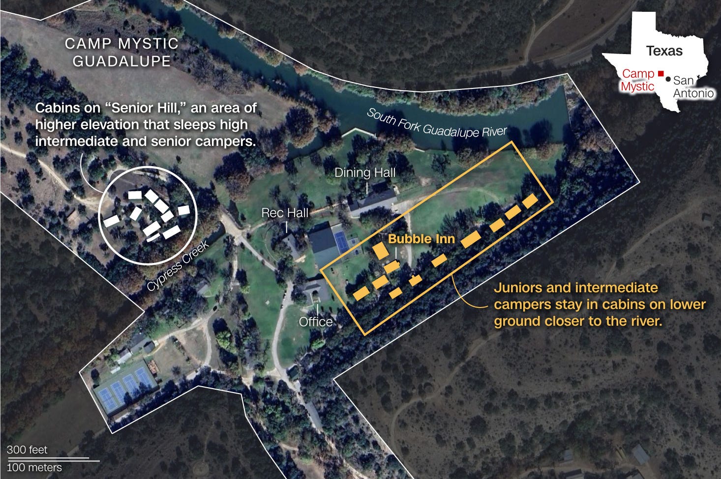
How the catastrophic Texas flooding unfolded, in maps and charts
Yes, I know it has my name on it and I am biased. I think stories like these are really interesting to work on, because the first thing anyone wants to know is “where did this happen?” How do you explain something so extraordinary and unexpected in chart and maps? Of course, other news outlets did similar graphics: Washington Post, Reuters, NY Times, USA Today if you want to see how different places approached the same story and data.
Additionally, I thought that this non-visual Washington Post piece, which is about a camp counsellor who saved her cabin of ‘littles’, was an excellent, moving piece.
Taxes, Brackets and Budgets
I *think* this was published before the One Big Beautiful Bill passed, so things have likely changed, but does a really great job of explaining exactly what’s going on with the federal budget more generally. I found some of the information really surprising.
See how your energy prices will change because of the GOP tax bill
Another story with my name on it, I know — but I am so pleased with this because it was a big learning curve and I really hope I served readers better by presenting the information this way. I think the biggest story in the US right now, other than immediate crises like the flooding, is the story of the bill and the impact this will have on communities. The problem is it is so all-encompassing that it’s really hard to get to grips with everything.
Odds and ends
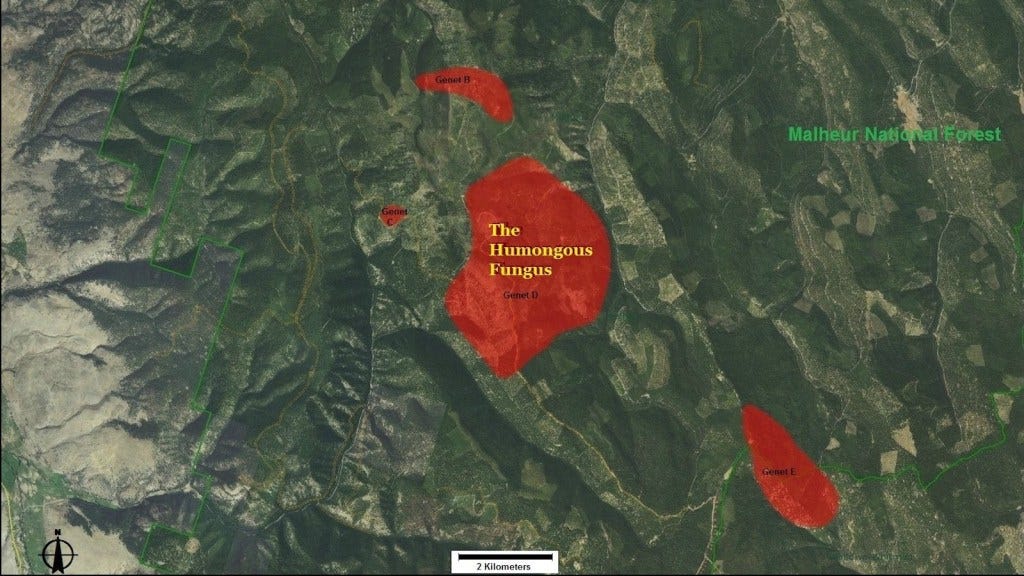
This fungus is so humongous that it can be mapped
This delightful article combines two of my favourite things: Maps and fungi. The Oregon-based fungi is "possibly the largest, oldest, and heaviest living thing on Earth". It's either twice as old as Stonehenge, or has been around since Plato walked the planet. Impressive, huh?
As countries scramble for minerals, the seabed beckons. Will mining it be a disaster?
Maybe I have just spent too much time consuming ocean-related media lately (Dave the Diver, The Shark Whisperer), but I found this story really fascinating and well-pitched. It’s possibly got too much data, but I think it approaches the issues in an easy-to-understand way. I think I probably feel more comfortable with finding things that are far away in space and mining those instead, rather than risking the ocean environment.
Under the Skin
Another excellent 3D visual piece from ABC News. I’m such a fan of these pieces, I don’t see anyone else pulling them off with such consistency and frequency outside of the NYT, and they always seem to be an angle or a story no one else has. This time, it’s about how museums are using CT scans to be able to better measure, understand, and identify their specimens without causing damage to them — in some cases leading to new discoveries about species.
Fun extra: You can download 3D scans of many of the 10,000+ specimens here at Morphosource, which is mentioned in the piece.
And… that’s everything I have for you this week. Thank you for reading! If you enjoyed Fair Warning, please forward to friends and tell them how great it is. If you REALLY liked it, you can buy me a coffee.
As always, you can get in touch with me on BlueSky at thatsoph.bsky.social or by replying to this email. You’re also welcome to send interesting stories or stories you’ve worked on, and while I can’t promise to feature them in future, I *will* take a look.
Have a great week!
Welcome Back!
Welcome back! As a long time anonymous subscriber, I've always enjoyed your round-ups.
I have <two> portable air conditioners here in London; I have greenwashed this in my mind through a belief that most of the energy powering it is (probably) solar, wind, nuclear or French. Treat yourself.