

Does a rising tide lift all boats?
Plus: Hurricanes, tariffs, and long covid

Good afternoon!
I feel like every time I log into Substack there is some new thing and I don’t understand what it is or what it does. I open it and I’m like “I have no idea what I’m doing” which is… good for someone who has been on this platform for a while?
As per usual I’ve been very busy but things are starting to look like they’re calming down and I’m finally feeling a little more settled here. Hooray!
Over the pond

Maps and charts: Visualizing Milton’s historic impact across Florida
This is my first bylined piece at CNN and it was a great team effort to pull all of these graphics together. It’s really quite astonishing how much data we have about the weather these days. And how beautiful mapping it can be.
Where Americans Have Been Moving Into Disaster-Prone Areas
A fascinating look at where Americans have been moving, and lots of them have been moving out of richer coastal areas and into areas where there’s a higher chance of fire, hurricanes, flooding, etc. Relevant and timely given the recent hurricanes.
The US Presidential Election

More Than 165 Lawsuits Are Already Shaping the 2024 US Presidential Election
Good analysis and visualisation from Bloomberg on the lawsuits that are related to the election. “It’s an ominous turn for the world’s oldest democracy. Judges aren’t supposed to decide who wins the White House. And even when courts don’t play a major role in the outcome, lawsuits can amplify the belief that vote counts can’t be trusted…”
3 charts that help explain how Trump’s tariffs would work
I must confess to not paying too much attention to the intricacies of policy promises (or threats) but this is probably of interest to anyone voting in November. Key line, in my view: “Study after study, including one from the federal government’s bipartisan US International Trade Commission, has found that Americans have borne almost the entire cost of Trump’s tariffs on Chinese products.”
The vast divide between Republicans and Democrats over fast food
I love this: Andrew Van Dam at the Washington Post spotted a conversation about campaigns spending money on food, and decided to investigate. The findings are fascinating: food establishments really do seem to be polarising, with Republicans favouring the golden arches while Democrats opt for pizza.
Elsewhere…
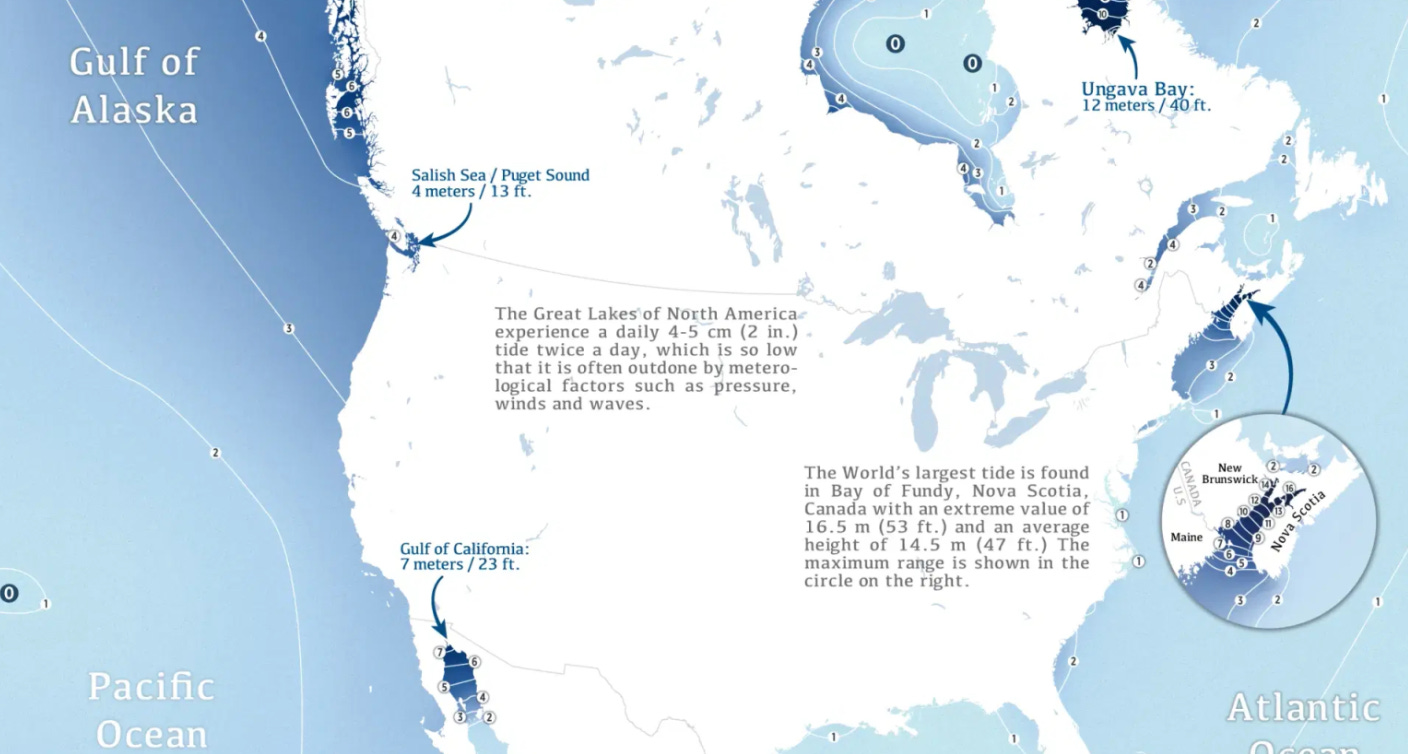
Hell or high water: The wonders and dangers of Earth’s tidal ranges
Feels relevant to all of the disaster stuff in this issue and there are some interesting lines in here: “During each half-day tidal cycle, around 100 billion tons of water flows in and out of [the Bay of Fundy in Nova Scotia]. That’s twice the volume that passes through all the world’s freshwater rivers during the same period.”
What long COVID taught me about life (and data)
Self-described data humanist Giorgia Lupi became extremely sick after her second time catching Covid. She recently gave this TED talk about her experience in documenting—via increasingly complex spreadsheets—her experience with long Covid, and published it in the New York Times. The essay itself is here.
Flattened in a year: How Israeli bombardment reduced most of Gaza to rubble
To mark one year since Oct. 7, CNN published a story about the amount of rubble generated by the latest attacks in Gaza. Reuters published something very similar. It’s interesting to look at the two of them and see how they approached similar data. I personally really think that illustrations can help elevate a story visually and emotionally, and both of these pieces make use of them in different ways.
Odds and ends

Welcome to Crokinole, the greatest game you’ve never heard of
Another fun, playable article from The Pudding. Bizarrely I HAVE heard of Crokinole: I am that kind of nerd. I’ve definitely seen the tables and I believe I have probably seen people playing it but I wasn’t that interested. It’s quite interesting when you sit back and think that humans entertainment often revolves around humans moving objects in specific ways into small spaces (snooker, football, netball, etc… Literally any other sport). What would the aliens make of it?
Elon Musk's Big Business and Conflicts of Interest With the U.S. Government
Billions of dollars worth of contracts are visualised here in just one chart (which is why it’s included), but it’s shocking to think of such an eye-watering amount of money, and then how adversarial the relationship is.
And… that’s everything I have for you. Thank you for reading! If you enjoyed Fair Warning, please forward to friends and tell them how great it is. If you REALLY liked it, you can buy me a coffee.
As always, you can get in touch with me on X at @SophWarnes on BlueSky at thatsoph.bsky.social or by replying to this email.
You’re also welcome to submit interesting things to me, or things you’ve worked on and are proud of, and while I can’t promise to feature them, I *will* take a look.
Have a great week!